Robin Khokhar
Robin Khokhar is an SEO specialist who mostly writes on SEO. Thus sharing tips and tricks related to SEO, WordPress, blogging, and digital marketing, and related topics.

What is important in the design of a website? On the one hand, the webpage should stand out and grab your visitors’...
Reply

What is important in the design of a website?
On the one hand, the webpage should stand out and grab your visitors’ attention at once, so its appearance is a matter of considerable concentration. On the other hand, think of the main purpose why people would visit your site. Some web pages contain a lot of text that should be read, while other sites may present their content in images, presentations, or even diagrams.
Also, there are e-commerce websites that should give their visitors a possibility to find products or goods quickly and order them quickly, but safely. Undoubtedly, the mentioned sites will include different ways of presenting the content. You have to remember that if customers have difficulties looking for what they need, they are likely to leave your site and opt for your competitors’ webpage.
So, your task is to combine a smart attractive look with easy-to-understand operational effectiveness. In pursuit of these, you may get into a trap of applying some elements that seem to be trendy but will turn to be inessential or useless.
Risks
The layout is the first thing that people see when your webpage has loaded, so the arrangement of elements plays an important role in making the first impression. To make your webpage look unique, you may experiment with the layout, but be careful with it. Sometimes experimental layouts simply create an impression of chaos, instead of attracting your customers’ attention. Moreover, if you want your company to look serious and significant, playful details and unaligned blocks can spoil people’s impression, as they will make the page look less businesslike.
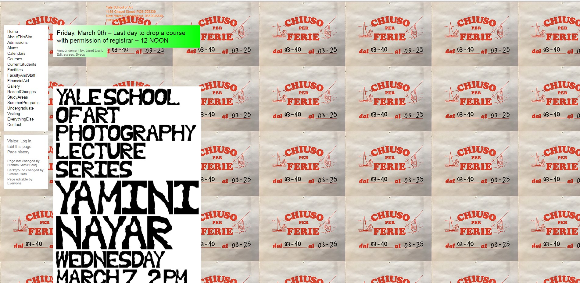 Stop this, please: Yale School of Art
Tips
– Asymmetrical elements may look good, but make sure that these elements don’t overlap.
– Apply hierarchy of elements, split any necessary parts to create visible areas between various elements and to make the perception of information easier. Blocks can save your space and help you arrange information logically, so think of possible ways to group your content.
– Additionally, if you have a lot of content, avoid using unbalanced designs, as it will be more difficult to discern information.
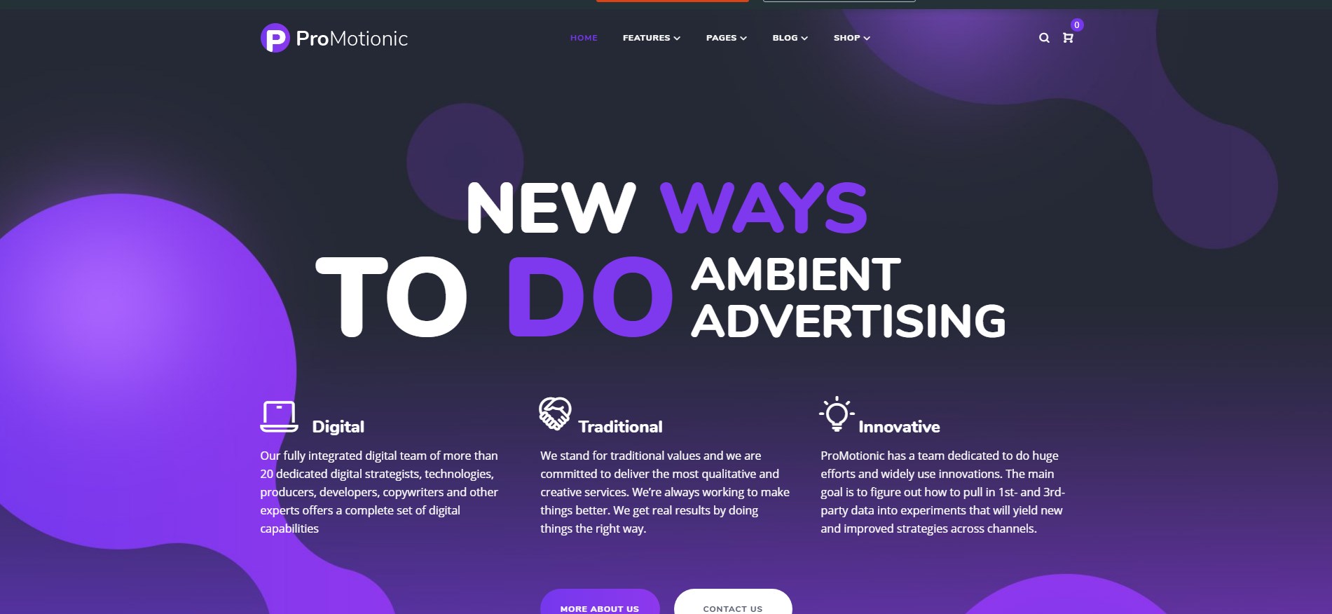
– Try to use the template. By the way, you could find a wide range of OpenCart, Shopify, Magento, PrestaShop and BigCommerce themes for your Store, something like this: 
Risks
Colors, as a layout, influence your visitors’ visual perception the moment they open your site. Using too many colors or colors that are too bright will strain people’s sight significantly. Moreover, there’s a risk to move attention from really important elements to less important ones if you apply colors wrongly. In addition, sometimes glaring colors do not match the company’s general style and create an unfavorable impression.
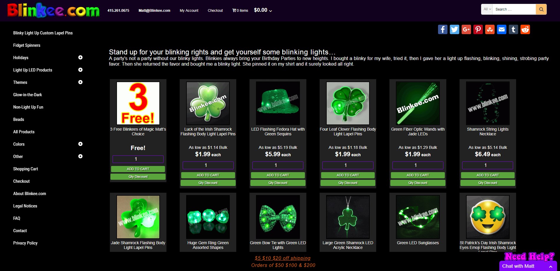
As an example: Blinkee.com
Tips
– Think of the main color of your background that will not be too bright and will not distract your visitors.
– Choose additional colors that will point to any necessary elements.
– Remember that the text should be clearly seen and shouldn’t seem blurry.
– Don’t overuse colors, i.e. try to reduce the number of colors that you apply on one page. If you like minimalist design, you can effectively create a powerful website by simply using black and white.
Risks
Typography, or fonts, is often used as a decorative element on the sites. Surely, fonts are a great tool to express your style and draw attention to certain pieces of information, but if your website includes too many different fonts, the effect will be quite opposite. You will not get your visitors’ interest; vice versa, they will be distracted and lose the interest in reading your information.
Another risk is to use fonts that are too small. This is usually true for the pages that try to include much information in the limited space. However, little typography can be very hard to decipher, and people will skip reading it, totally, thus missing important facts or thoughts.
Tips
– Avoid using small typography if your visitors have to scan the information.
– Apply typography wisely, thinking of styles and associations. Fonts can cause different associations, even if the latter is unconscious. For instance, Gothic fonts make us think about the old days in history, while bold typography can evoke an impression of strictness. If you don’t mean to add any connotation, select more neutral fonts.
– Refrain from using fonts of many different styles and sizes on the same page not to distract people’s attention.
– If you have a possibility, hire a professional who will develop your company’s custom typography and logo. It will make your webpage look consistent and outstanding.
Risks
If you deal with e-commerce and describe something, you may wish to present as much information about each product as possible, making it look more attractive. There’s no need to do this, as too many details in a window will make your webpage look messy and confusing.
Tips
– Exclude unnecessary details, choosing the most valuable information. Learn to find out what really matters to people when they are looking for a particular item.
– Make your details relevant to the content.
– Keep in mind that your headlines, product categories, and announcements should be easy to see and even easier to read. People can find out all the details if you provide them with a link to follow, and they are sure to do this if they are interested in that information.
This is a part of your site’s functionality, so the more comfortable people feel while browsing your website, the more likely they are to stay on your webpage. In other words, everything should be organized in such a way that people don’t even think of where to look for certain elements.
Risks
Not to distract your visitors’ attention from the main elements, you may have a chance to include navigation buttons that are too small and too difficult to see at once, so people will struggle in finding them. If you deal with e-commerce and have lots of elements to present, you may create a menu with multiple categories and subcategories that will look too complicated. At the same time, you may be tempted to use the one-page look of your website, to avoid complex menus, which can lead to people’s endless scrolling to reach the end of the page.
Tips
– People should be able to find their way around the site easily, including the way back when they need to return to the previous piece of information.
– If you need a carefully organized menu with numerous products or services, a drop-down menu will be your perfect choice, because it gives a possibility to add items into categories and subcategories. Bear in mind the necessity to keep your menu logical and clear, so avoid creating unrequired subcategories.
– Choose an anchored menu if it doesn’t prevent your customers to see the information.
– Include buttons, such as ‘Back-to-the-top’, to facilitate navigation.
Risks
Pop-up windows are a good way to draw people’s attention to different kinds of information, including promotions or sales. However, don’t test your customers’ patience by making them close pop-up windows all the time! It really irritates people, especially when the information that appears on the screen while they are scrolling the page is not relevant to them. Moreover, people should have their time searching for necessary items before a robot appears suggesting help. Remember that not all the people are fond of communicating with robots or are eager to call your site’s workers before they even look through the list of search results.
Tips
– Pop-up windows should include really important information that can make people interested.
– Don’t be too persistent in suggesting anything, including help, with pop-up windows. It feels as if you were intruding into the process of somebody’s reading or investigating something.
Risks
With contemporary technologies, creating animation is not a very difficult and demanding process, so you can use it to catch your visitor’s eye. However, if your site is overloaded with animation, it will have an opposite effect and distract your users’ attention. Moreover, it can slow down the process of loading the site. As people value their time, they are likely to quit a slow site, and, as a result, you will lose customers.
Tips
– Include one or two videos that represent the most necessary information about your goods or services if you think this is the best way to showcase your company.
– Avoid using large background videos that slow down the webpage.
– Subtle animation, such as logo animation, will be appropriate and make your website memorable.
Risks
To impress people when they open your website, you can apply a Parallax effect. It does create the sense of full immersion into the site, and moving elements trigger your customers’ desire to scroll down the page. Still, if you overdo with Parallax, people can have motion sickness and a negative attitude to your webpage.
Tips
– Making people engaged with Parallax, remember that visual effects should be applied only to draw attention to something more important. Moving elements are not definitely the thing that people come for when they were searching for some information, so don’t make them forget their main aim with too many visual effects.
Risks
While saving your visitors’ efforts and time to find the button to play audio or video, autoplay can be a very annoying element of your site. What if the sound of a person’s device was too loud and the person didn’t expect any sounds to be produced without their intention? The person is likely to get frightened and, possibly, to shock others around. The chance is that the person will leave the webpage as soon as possible to stop that unexpected noise.
Tips
If your website includes audio or video, switch off autoplay for all multimedia elements. If people have a possibility and a desire to listen and to watch something, they should be able to play a video or audio themselves. So, simply make sure that your viewers will not have difficulties in finding the way to play the element.
Risks
Firstly, you may wish to include photos of the best quality, especially if you are creating a model’s portfolio, to showcase information to the best advantage. Of course, high-resolution pictures are a must in this case, but they may make the loading of your website slow. As people don’t want to lose their time, they can skip your site.
Secondly, there is a temptation to use stock photos to save time and money. In this case, your visitors can have encountered similar pictures on other websites, so your page will not look singular.
Tips
– Before using high-resolution photos on your site, make sure that your webpage is optimized for that. Retina-ready sites are a good choice for uploading pictures of the best quality without worrying that the site will lose its functionality.
– When you are choosing pictures, try to make your page unusual. It is really worth having unique photos to make your page memorable. Also, keep in mind that your visitors are people who can feel different emotions, so engaging photos that evoke positive feelings will improve the impression from your website.
In conclusion, while designing your webpage, remember that it should be a combination of attractive use with effective functionality. First of all, the visual impact that your visitors get is the first thing that will make them wish to stay on your page. Choose an appropriate layout, group elements and apply blocks to structure the page. Additionally, avoid using too many details and unnecessary elements, and don’t overdo with bright colors or extraordinary fonts of different sizes. Apply animation, Parallax, background videos very carefully not to make your visitors distracted and not to slow down your website.
Secondly, facilitate your customers’ navigation around the site, arranging items into logical categories and subcategories, as well as structuring the menus without making them too complicated. Don’t irritate people with long scrolling or hidden elements that are difficult to find. 
Robin Khokhar is an SEO specialist who mostly writes on SEO. Thus sharing tips and tricks related to SEO, WordPress, blogging, and digital marketing, and related topics.


 Best Practices for Outsourcing Development in 2025
Hi,
Nice! This is a very worth reading article for me. Thanks for you worthy suggestions. Everyone should know these trends before design a website.
A much detailed tips giving article on how to cope with risky web design trends..thanks for sharing with us. Cheers 🙂
This is really a nice piece of information. Attractive, responsive and optimized website design is very important for better user experience today and this article has described every point very deeply. Thanks for sharing.
It was interesting to learn that you should implement a hierarchy of elements into your website. I can see how websites are really important to business owners because they showcase their business to customers. With that in mind, it must be important to make sure that it has a good design.
Nowadays, web designing is in-demand. Anyone with knowledge of web designing can create a design for a website. But, having knowledge alone is not enough to create a good and responsive web design. Sometimes it becomes important to know the prospects of some design also.
Great Information. Great said. I love it. Thanks for this useful information.
The website designs now are really not that hard. There are available templates and other similar stuff. Taking risks on your website design is a bold move that only a few can do.
Great. With the help of these things, we can make our business very popular. Great said. Thanks for this useful information.
Awesome article, thanks for sharing such a useful information regarding Web Designing.
Such a great article!. I get a clear picture of what web design trends are risky by nature. Thanks a lot.
Very Nice. Such great information you have shared with us. It is very beneficial for all of us
Awesome info on web designs and agree that if you put too much it will slow down the website I already have read this twice I also do web designing in San Diego and this blog post definitely helps me
Hi Robin Khokhar,
Web Design business has become much competitive than earlier. Proper guidance is a must for startup. The guide provided by you is very much helpful and easier to understand. Thanks for sharing valuable information.
For business promotion a attractive website is must. It helps to improve business and generate more traffic.
Great article. Thanks for sharing this. The design is on one of the most important aspects of a good website. The design should be as such that it immediately connects with your target audiences.
thanks for sharing relevant information about website design. before designing a website one should be aware of these methods.
Wonderful blog. Find it much interesting, informative and useful. Keen to know more about it in details.
Thanks for sharing valuable information. before designing a website every designer should be aware of these designing methods.
Thanks for sharing! I believe every designer of websites should be aware of these basic points.
Great article. Thanks for sharing this. The design is on one of the most important aspects of a good website. The design should be as such that it immediately connects with your target audiences.
Yes right, web designing is not simple. For an interactive web design, a research is needed to attract the target users on the site by having the relevant content on it at right position.
Awesome post! I was looking for some information because I’m getting my website redesigned and my team of web developers are doing a fabulous job so I’m going to share this post to help them progress more.
Excellent post, full of important knowledge and you have written great tips for everyone. One of the best posts I have read today, I am highly impressed with your post. Well written in a simple and easy way. Thank You
Info is super helpful yes web designing is not a easy to task i think its getting to be more difficult thanks for sharing this with us it really helps
Great tips here! I always find that clean and simple is best. I mean look at the most successful websites out there! Most of them have a very clean feel (white or plain background). Stay simple and you’ll do well. I think a lot of people over think it, unfortunately.
I have built my web development and designing company and I am now feeling good. I think everyone should take some new steps to be successful.
Such a nice article and one more thing you can’t forget mobile friendly risk because after the google’s algorithm update ‘mobile first index’, it is mainly focusing and giving prominence to the website which are mobile friendly.
Thank you so much for your great tips.
One of the best blog that i read today.
I have a question:
Is there is any plugin to make my website responsive?
yes, There can be But I recommend you to go with a responsive theme.
HI,
First of all your writing skills are excellent, Fully understandable blogs. Your all web blogs are very helpful in my work place. You always share latest trends in every fields, And after read your blogs I make a big fan of yours.
Nice blog than thank you for these reminders. I always read your blog on a daily basis in your blog.