Kate Parish
Kate Parish is the Chief Marketing Officer at Onilab with over 8 years in Digital Marketing in eCommerce web development. Her primary areas of professional inte

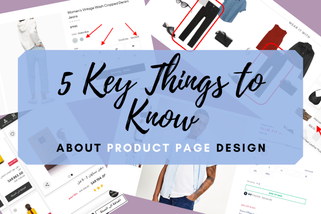
Product pages are among the most integral parts of an eCommerce store. This is where your shoppers spend most of their time...
Reply

Product pages are among the most integral parts of an eCommerce store. This is where your shoppers spend most of their time and make purchasing decisions. That’s why to convert such a page type deserves the attention it needs, thus making the product page design important.
In this article, we’ll introduce you to 5 must-knows regarding product page design. We’ll share actionable tips, give recommendations, and provide you with examples.
Mobile eCommerce is gaining momentum, and there are over 5 billion mobile users in the world. So if your store is not mobile-ready, you may be losing sales right now.
Mobile design dictates different rules than the desktop one.
Here are the most significant things to focus on:
Use the best practices of native application design (f.e., place the menu bar and clickable elements at the bottom of the page so they’ll be reached by thumb);
Mobile users tend to be more impatient than desktop ones. So your ultimate task is to provide them with a smooth and lightning-fast experience as you think through your eCommerce website’s product page design.
This is exactly why progressive web applications are the new big thing in eCommerce. As of now, a plethora of online retail business owners is investing in rebuilding their sites as progressive web apps. They opt for Magento eCommerce development services (or other platforms) to optimize the storefronts and provide users with seamless mobile and desktop designs and performance. While being a website that is scalable and works in a browser, the storefront shares many UX\UI features of a native application and is super fast.
These are a couple of screenshots of what the progressive web application of the Amajed4oud website looks like on a mobile device. The UX\UI is very reminiscent of a native application, agree? Pay attention to the product page screenshot displayed on the right. We see a neat gallery, price, rating, and the “Add to Cart” and “Buy Now” buttons conveniently stuck to the bottom of the screen.
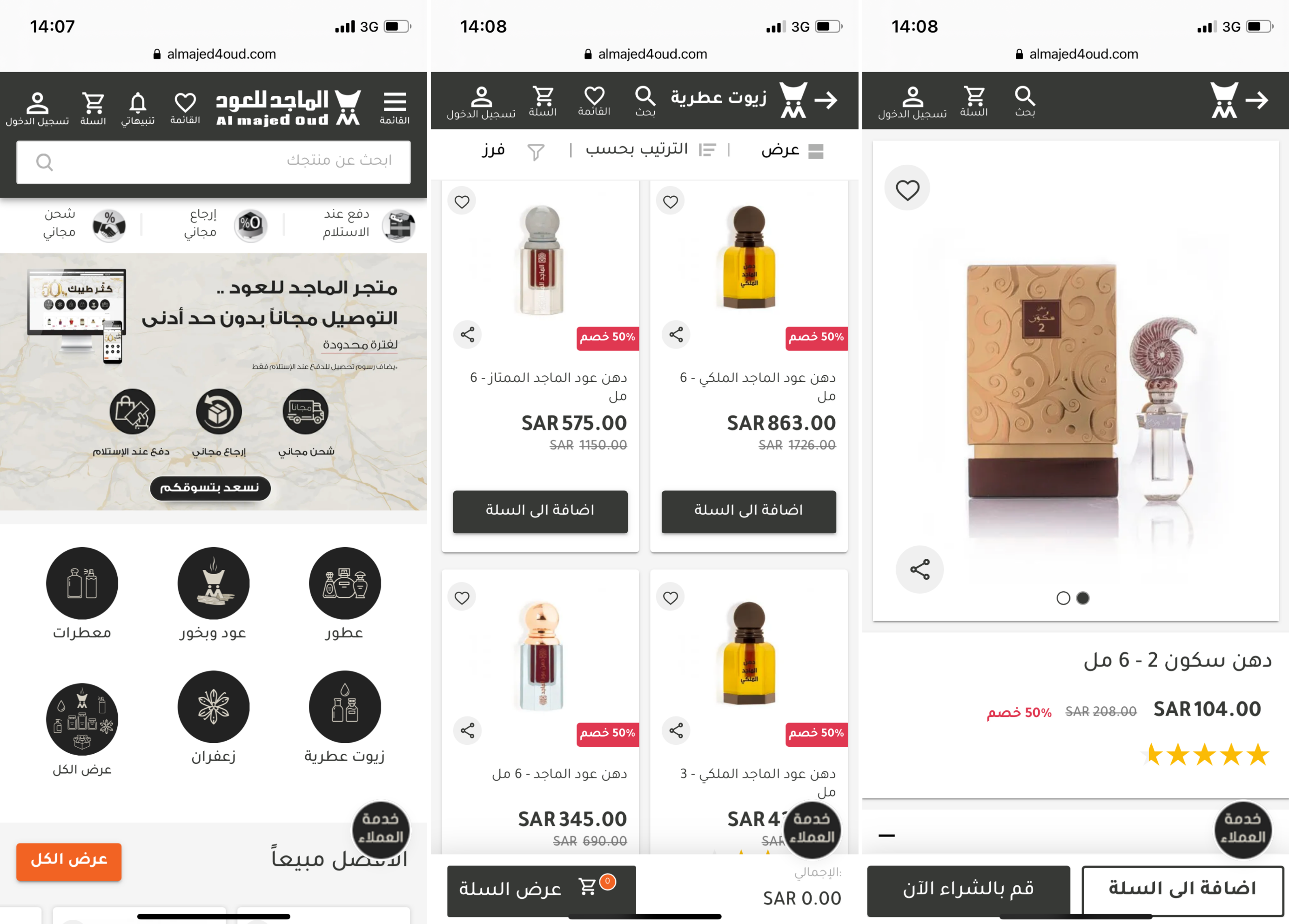
Screenshots were taken on the official Amajed4oud PWA website
When users open a page, especially of a specific product, they see not only pictures but textual information as well. This is why it is important that you give your product naming and descriptive texts due consideration.
What do product titles do? Their major role is telling your buyers what you’re offering and what are the peculiarities of this or that item on sale. In order to ace your product titles, make sure to indicate:
Some details about the product (i.e., its material, color, size, weight, etc.);
But which design should a product title have on a product page? The best practices are making the title stand out a bit. For example, it may have a contrasting color and be of a slightly larger font than the rest of the text that follows it. As a rule, the title is placed in the top right-hand corner of a product page for desktop view. For mobile view, it is put at the top of the page above the gallery.
As such, the official Tommy Hilfiger online store chooses its brand colors to highlight the title of its products. The product name is bright red, in all caps, in a bigger font than the rest of the text, and is placed in the top right-hand corner.
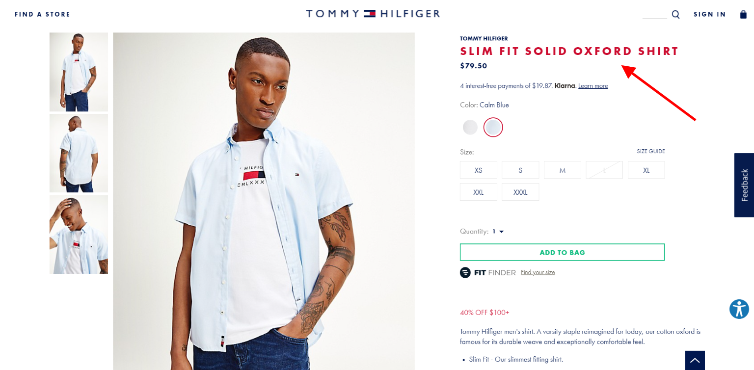
The screenshot was taken on the official Tommy Hilfiger website
Crafting a decent product description and accenting the item’s details is your chance to help a potential customer to make up their mind about a purchase. This is an ideal place for pitching your product’s best features, giving clients a reason to buy.
Product descriptions and details should mention the key peculiarities of a product that make it stand out. And while SEO and the descriptiveness of the copy matter, most users just quickly skim through the text. Therefore, the information should be split and well-organized so that the user can quickly get what they are looking for (in mere seconds).
This is how NARS Cosmetics organizes its product descriptions. The short overview is given in the top right-hand corner, while the details and a more extensive description are located below the gallery. The description has a catchy heading and the text highlights the product’s main features (long-wear, high-pigment, blendable, etc.).
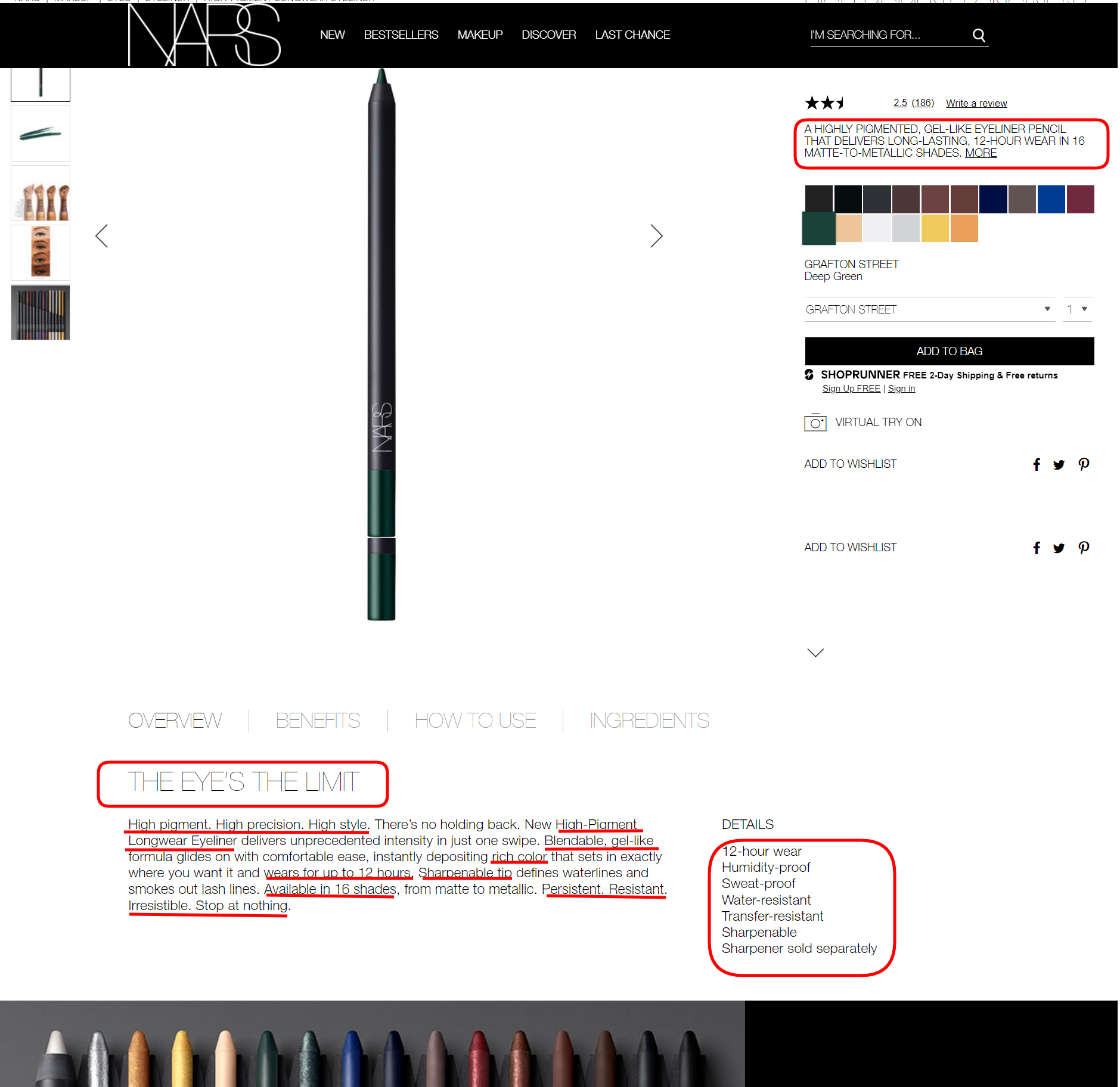
The screenshot was taken on the official NARS Cosmetics website
Here’s another piece of design advice for you. Although description texts are important, they shouldn’t be too excessive. I.e., make sure that all the information is broken down logically and that the text is readable (choose fonts and their size wisely).
This can surely improve perception, which is especially important for smaller screens like those of smartphones. Therefore, consider the option of opening the product’s description in a pop-up window. Alternatively, show only several lines of text followed by “Read more”.
To provide a good product page design example that shows the product details concisely, here’s how Clavin Klein approaches the matter. There’s no description whatsoever in the above-the-fold area, which isn’t overcrowded by elements. We only see the most important information: the product name, price, rating, quantity button, and the “Add to Bag” call to action. But, importantly, look at how the details are organized. There’s plenty of space to pick the size, and the color choice is intuitive too.
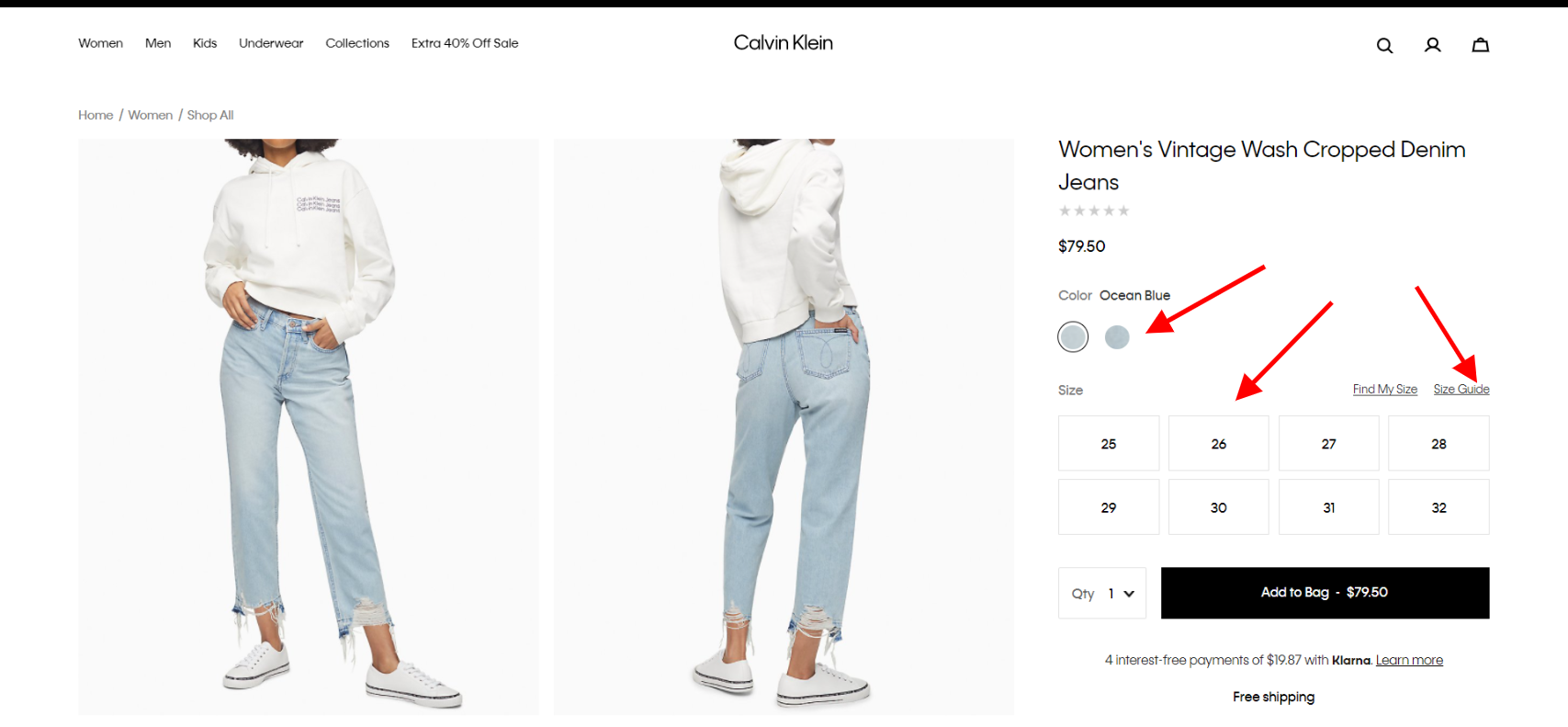
The screenshot was taken on the official Calvin Klein website
When crafting your product page web design, you should surely take advantage of the opportunity to sell additional products to your buyers. For this reason, we recommend adding cross-selling blocks to the product pages. For example, matching or similar items can be pitched in the form of “You May Also Like” or “Goes Well With”.
The cross-selling design that the Banana Republic uses is a wonderful “move” for eCommerce. As such, users are offered entire looks with matching items and accessories to complement the searched item. Undoubtedly, there’s a big chance that such products will be added to the cart as well.
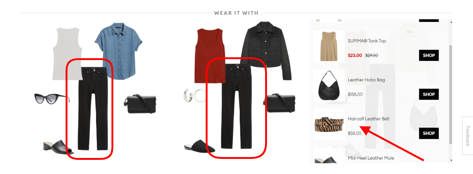
The screenshot was taken on the official Banana Republic website
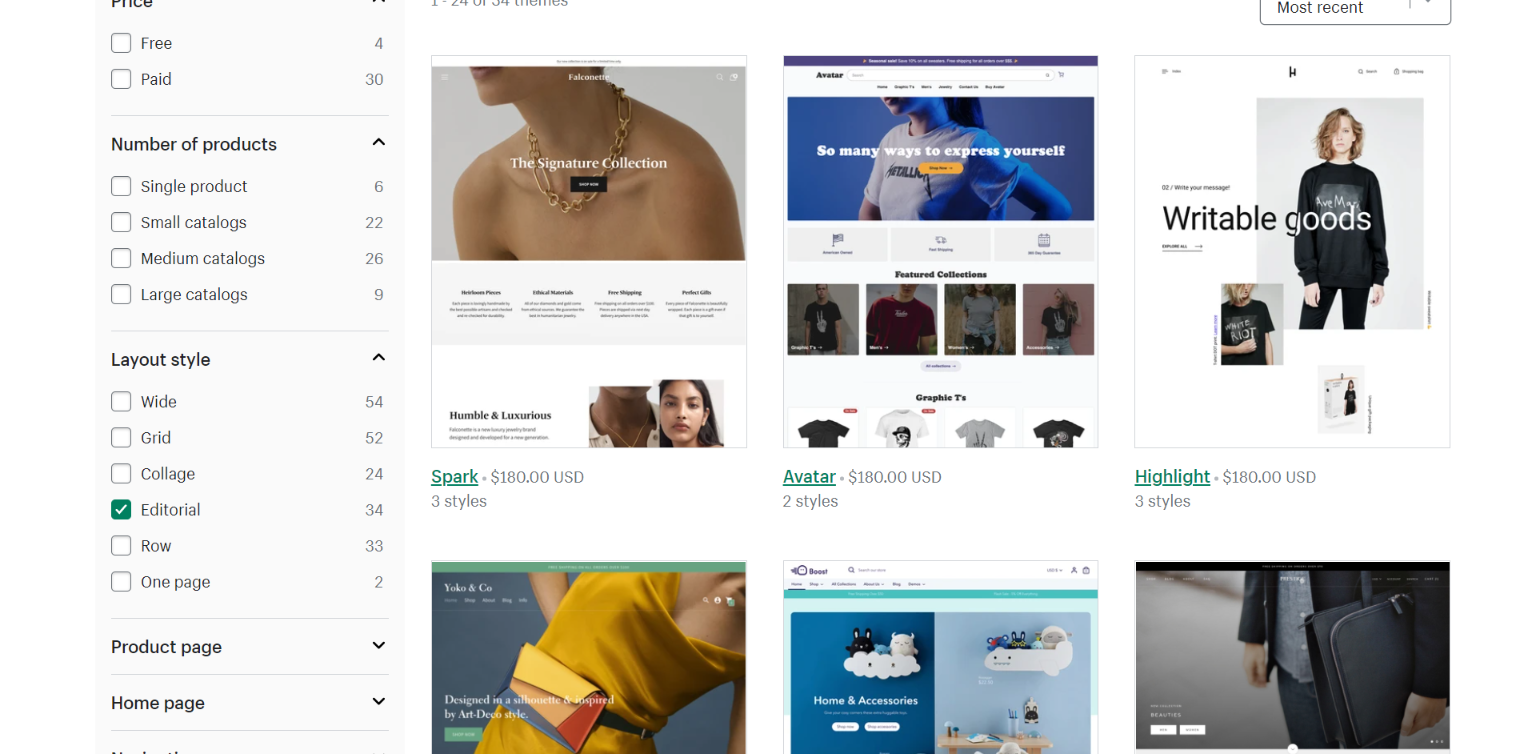
What if you don’t want to invest in a custom design crafted from scratch? What if you need a faster time-to-market for your store or can’t afford an expensive redesign at the moment? You can go for a template-based solution.
The choice of a store theme is quite a complex task. You need to make sure that its color, design elements, and overall layout correspond to your brand’s identity and represent you in the desired way.
There are two options to choose from: a ready-made template or a custom theme. Both have their pros and cons.
a) Ready theme pros:
b) Ready theme cons:
May lack in functionality/customization;
The screenshot was taken on the official Shopify website
c) Custom theme pros:
Limitless customization.
d) Custom theme cons:
May take a long time to develop;
Usually, custom theme development (with designs crafted specifically for your store) delivers higher ROI. By carefully reviewing the store and audience, you can not only identify the UX/UI pain points but also boost your store performance and make it go faster. And a faster store means more conversions.
There’s a lot you can do to boost the conversions of an online store’s product pages. With e-commerce growing by the day, you must rethink your design so that the store is easy to shop on smartphones. Keep things simple, mind page speed, and make sure the products you sell are presented at their best.
Suggested:
Effective Email Marketing Strategies for E-commerce website to generate More Sales.
How do I write good product descriptions on Amazon /Shopify?
Kate Parish is the Chief Marketing Officer at Onilab with over 8 years in Digital Marketing in eCommerce web development. Her primary areas of professional inte


 Why Visual Content is important for brand marketing?
Great post. It is constructive for me. Thanks for sharing valuable tips.